Icons: Clarity booster or just pretty decoration?
Icons are everywhere: on websites, in apps, in presentations and brochures. Small symbols that promise a big impact. They're meant to make information easier to grasp, provide orientation, and visually break up content. But not every icon fulfills this purpose. Sometimes they're just decoration that creates more confusion than clarity. So the question is: Are icons really clarity boosters, or are they often just a design accessory without added value?
Why icons are so popular
Icons are so successful because they are based on a simple idea: a picture is worth a thousand words. Instead of lengthy texts, symbols show directly what something is about – at least in the ideal world.
Quick orientation: A telephone handset icon indicates contact options, a magnifying glass stands for search.
Visual hierarchy: Icons help to structure content and break up texts.
Recognition: Users quickly learn what certain symbols mean – and expect consistency.
But this is precisely where the danger lies: If icons are not used clearly or are used inconsistently, the opposite of clarity is achieved.
The pitfalls of unclear icons
As Aurora Harley from the Nielsen Norman Group already says:
"Icons must first and foremost communicate meaning in a graphical user interface. Icons are, by definition, a visual representation of an object, action, or idea. If … that object, action, or idea is not immediately clear to users, the icon is reduced to mere eye candy … and to visual noise."
Ambiguity: Not every symbol is universally understood. A stylized airplane can represent "travel," "departure," or "shipping" — depending on the context.
Decoration over function: Many websites use icons merely to fill space. The result: Users don't take them seriously and ignore them.
Inconsistency: Using flat, minimalist icons in one area and ornate 3D symbols in another creates an unprofessional impression. This is detrimental to a consistent and reputable brand image. Therefore, we at HCG corporate designs recommend incorporating icon design into the branding process, as we did for our client Spedifort, for example.

A good icon should therefore be clear, consistent, and purposeful .
Branded icons as a brand building block
Instead of relying on generic icon libraries, more and more companies are opting for branded icons developed in accordance with their corporate design. The advantage:
Brand consistency: Branded icons reflect the brand's colors, lines, and style – and therefore appear professional. You can see some examples of icon design in branding in the tips section of HCG corporate designs.
Recognition: Even small symbols contribute to brand identity. Users subconsciously recognize that these are "your" icons.
Differentiation: In a digital environment full of standard symbols, individually designed icons immediately stand out.
At HCG corporate designs, we develop branded icon sets so that they are perfectly integrated into a brand's grid, color scheme and typography – thus becoming true mini-ambassadors of the brand.
When icons really help
Icons unfold their added value particularly in these contexts:
1. Navigation and user-friendliness
Clear icons make it easier to find your way around – for example, with filters in online shops.
2. Infographics and figures
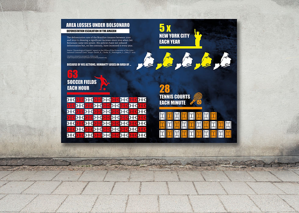
Icons help to visually support complex content and make relationships easier to grasp. They are particularly effective in infographics: they act as visual anchors, immediately drawing the eye to key points, and they are space-saving, allowing even complex content to be presented in a compact manner.
3. Service overviews
Instead of just text lists, services or benefits that are marked with icons are much easier to "digest".
4. Mobile interfaces
On small screens, icons replace space-consuming words.
When icons should not be used
If they are purely decorative and have no informational value.
If they are unclear or ambiguous.
If they distract from the actual call to action.
Icons should never be used as filler material, but should always have a function.
Best practices for icon design
1. Clarity before beauty: An icon must first and foremost be understandable.
2. Consistency: All icons should follow the same style (line thickness, colors, etc.).
3. Use in a grid: Clear grids ensure that icons remain harmoniously embedded.
4. Consider branding: Colors and shapes should be aligned with the brand identity. The corporate design manual provides the key information here.
5. Testing: Check whether target groups actually understand the icons – not just whether designers find them beautiful.
Below are some examples from our daily business of what branded icons look like. Click on each image to go to the corresponding project in our portfolio:



Conclusion
Icons can be true clarity boosters – if they are thoughtfully designed and strategically used. However, if they are used purely for decoration or without consistency, they lose their effectiveness and can even impair usability. The key lies in branded, consistent icon sets that are firmly anchored in the corporate design and convey the brand message even in the smallest details.
Consider whether your icons on your website, in presentations, or in infographics truly contribute to clarity — or whether they are merely pretty filler images. At HCG corporate designs, we develop custom icon sets that make your brand distinctive, even on a small scale, and ensure clarity. Feel free to contact us.


Comments