7 design flaws that really impair your lead quality
- Jun 1
- 5 min read
Many companies eventually ask themselves the same question:
Why does our website generate leads – but not the right ones?
The discussions go nowhere, the budgets are unsuitable, or the inquiries are too vague. The impression quickly arises that the target group is "not right" or that the marketing needs to be adjusted.
However, a look at the website often reveals a different picture. Because it determines not only whether someone makes a request, but also who (!) makes the request.

Why bad leads are (also) a design problem
A website acts like a filter. Not (necessarily) technically, but primarily visually and structurally.
It sends signals like:
How professional is this company?
In which segment does it operate?
Does it suit me – or not?
This categorization happens in seconds – long before the content is read in detail.
If these signals are not clearly set, a diffuse picture emerges. And it is precisely this picture that then attracts the wrong leads.
1. The design appeals to the wrong target group
Design is always positioning, too.
A high-end company that uses generic stock photos quickly appears interchangeable. A technically sophisticated provider with a playful color palette loses clarity. And minimalist websites lacking discernible depth can, despite good content, give the impression of a lack of substance.
The problem is not the individual element – but the overall picture.
If this image does not match the actual performance, a discrepancy occurs.
And it is precisely this discrepancy that causes the wrong target groups to feel addressed.
2. Your website looks generic
Many websites are technically well-executed, but they don't stay in mind.
They work, load quickly, look "modern" – but they don't tell any original story.
For users, this means:
There is no clear reason to choose this particular company.
The consequences are rarely immediately apparent, but they become evident in the quality of incoming leads. If no clear differentiation is discernible, non-committal or price-driven conversations are more common.
3. Lack of visual prioritization
A common weakness lies not in the design itself, but in the weighting of content.
When everything seems equally important, users lack orientation. They have to decide for themselves what is relevant – and this is precisely what leads to decisions being postponed or not made at all.
At HCG corporate designs, we therefore place great emphasis on defining at least one specific goal of a website right from the start. This sometimes causes confusion, because many people initially want to talk about design.
In practice, however, it is crucial:
Without a clear goal, there can be no clear prioritization.
And without prioritization, there can be no effective design.
“Simply making it beautiful” might work visually – but not strategically.
4. Inconsistency between website and the rest of the brand's visual appearance
This is often the most powerful lever – and at the same time one of the most common mistakes.
Companies today don't operate through just one channel, but through many: website, LinkedIn, presentations, sales. All these touchpoints together shape the impression of a brand.
If these layers don't align, no clear picture emerges, but rather a fragmented impression. Potential customers sense this immediately. Not consciously, but clearly enough to become more cautious.
One example of this is Randall Media Factory. Here, it wasn't about a single brand, but rather an umbrella brand with three sub-brands. Different topics, different target groups – but a common goal.
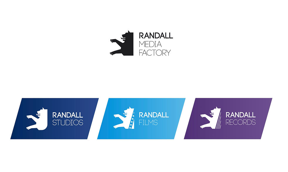
The challenge was to visually unify this diversity without homogenizing it. All sub-brands needed to retain their own character while conveying the same "vibe". Only through this visual framework could a cohesive brand identity be created that is easily understood and appeals precisely to the right clients.
This effect is also evident at Immobilien Praxis Köll. Their online presence was deliberately designed to stand out from traditional real estate experts without sacrificing professional clarity. The key was not the individual medium, but the consistent corporate design.


Consistency is no longer a detail. It is the foundation upon which a company can be properly categorized.
5. Unclear positioning in the design
Many companies know very well internally what they stand for. However, this clarity is not always reflected in their visual appearance.
This leads to content and design sending different signals.
Users don't get a coherent overall picture. It remains unclear how the company should be perceived, what its level of expertise is, and exactly what differentiates it from others.
And this is exactly where the situation changes:
Without a clear perception, the decision becomes difficult – the decision to take a closer look at the company, to make contact, or to initiate a concrete project.
6. Lack of connection between content and design
In many cases, content and design are considered separately. However, the real strength lies precisely in their interplay.
Design can not only structure content, but also enhance it and make it more engaging. Besides typography and layout, interactions and animations also play a role.
One example is our branding and web design client S11 System from Munich. Here, we not only implemented the website but also developed the entire branding. Key themes such as transcendence in coaching were deliberately translated into visual elements.
Targeted scroll animations create an additional layer that not only explains content but also makes it tangible.
At the same time, one point should not be underestimated: accessibility. A website must not only look good, but also be accessible. Clear structures, sufficient contrast, and properly formatted ALT text are not details, but part of the overall effect.
More information can be found in the article on accessible web design.
7. No consistent design system behind the brand
Many websites grow over time. Content is added, pages are expanded, and the design is adapted. What's often missing is a system that holds everything together.
Without this system, an inconsistent brand appearance will result in the long run. Decisions will be made situationally, instead of being based on a clear foundation.
At HCG corporate designs, we therefore understand branding as a sustainable system. Not as a one-off measure, but as a structured foundation that grows with the company.
Such a system ensures that design remains consistent, decisions are made faster, and the presentation remains stable even during growth.
Conclusion
If a website generates many irrelevant leads, it's worth taking a closer look at what it actually communicates.
Not in terms of content, but visually and structurally.
The quality of leads is not a matter of chance. It is the result of clear signals, consistent implementation, and a functioning corporate design system.
If you have the impression that your website is attracting the wrong target group, a structured analysis of your brand presence is worthwhile.
Not to optimize individual elements – but to understand the overall picture and whether it fits with what you want to achieve.


Comments