From sketch to logo
When you want a logo designed, you may be wondering, "What would my perfect logo look like?" Our formula for a perfect logo is:
maximum recognition value
+ maximum flexibility
+ quick memorability
− excess complexity
= perfect logo
From this, we strive to create the best possible balance: a lastingly strong logo, individually tailored to the client, their product, and their target audience. You can see what this looks like in practice by looking at some sketches from our work.
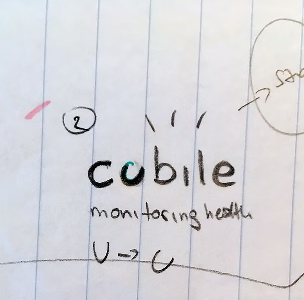
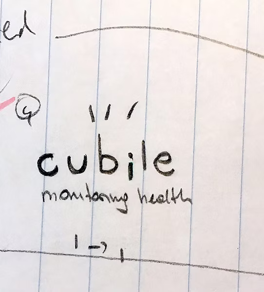
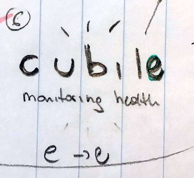
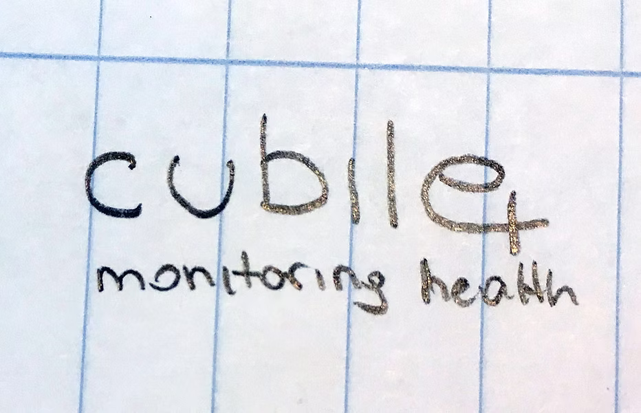
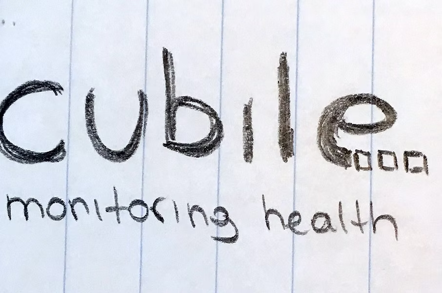
Branding for cubile monitoring health
Cubile is a medical device for hospitals, nursing homes, and home caregivers. The first step after the briefing meeting with the client was an internal brainstorming session, in which additional terms were collected for each core concept. As always with brainstorming, it's important to think completely freely. Anything is allowed (and welcome) at this stage. There are no limits to creativity.
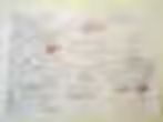
This brainstorming session served as the basis for pencil sketches for subsequent logo designs. We always start with pencil sketches on paper, as this allows for maximum flexibility and speed. Only much later are the best designs drawn on the computer and presented to the client.
Our idea was to develop an animated logo to incorporate the theme of "movement". After all, movement plays an important role in the cubile medical device. Cubile consists, among other things, of a foam mat placed under a hospital bed. In the event of even the slightest deviation from normal values regarding breathing and heart rate, etc., it sends a warning signal to an app installed by the doctor on their mobile phone, tablet, or desktop PC. A similar signal is also sent in real time in the event of risky movements (risk of the patient falling).
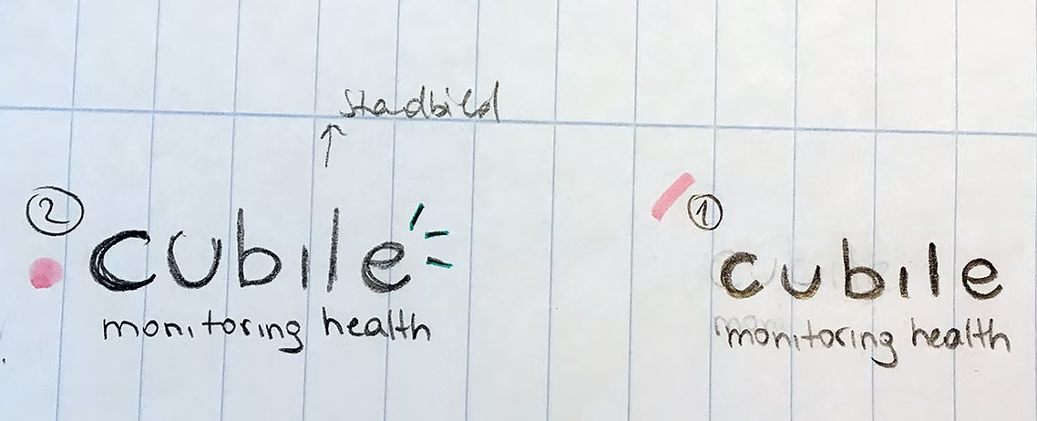
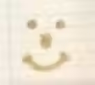
These logo sketches focus on the topics of "patient monitoring and alerting":
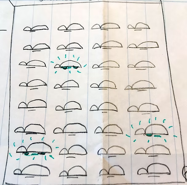
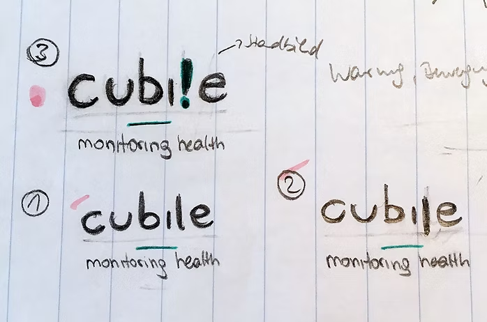
The following logo sketches deal with the topic "values outside the normal range" (differently positioned letters, letters "outside the norm") and "warning message":
Other logo sketches focus more on the possibility of modular expandability of the product:
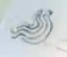
Here are some more logo sketches dedicated to the topic "movement and the warning signal generated by it":
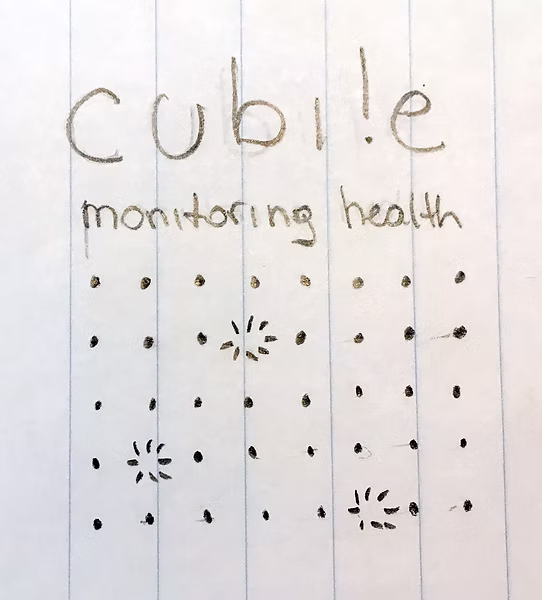
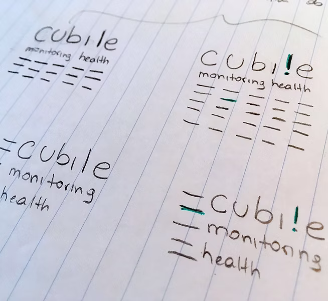
Here you can see the final logo:

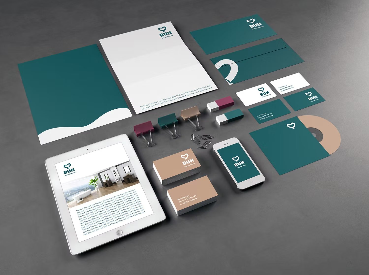
The rest of the fully designed branding including business cards, trade fair wall design, brochure, infographic, website, etc. can be seen in the portfolio.
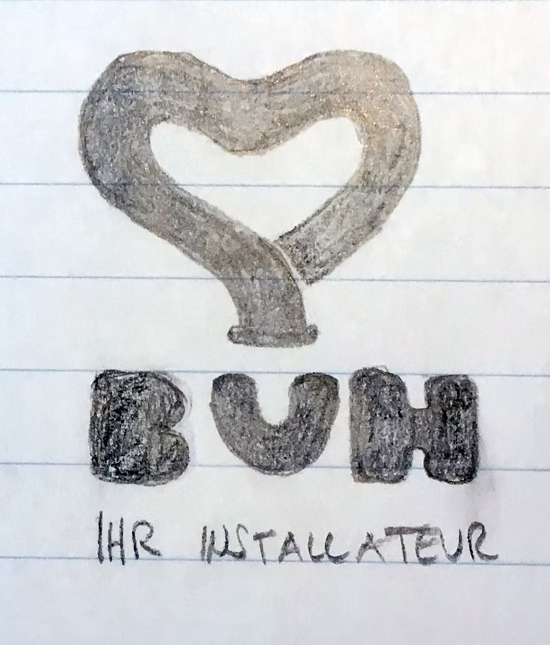
Branding for a plumbing business
BAD UND HEIZUNG (BUH) is a local plumbing business that offers complete solutions from a single source for bathroom/sanitary and heating systems.
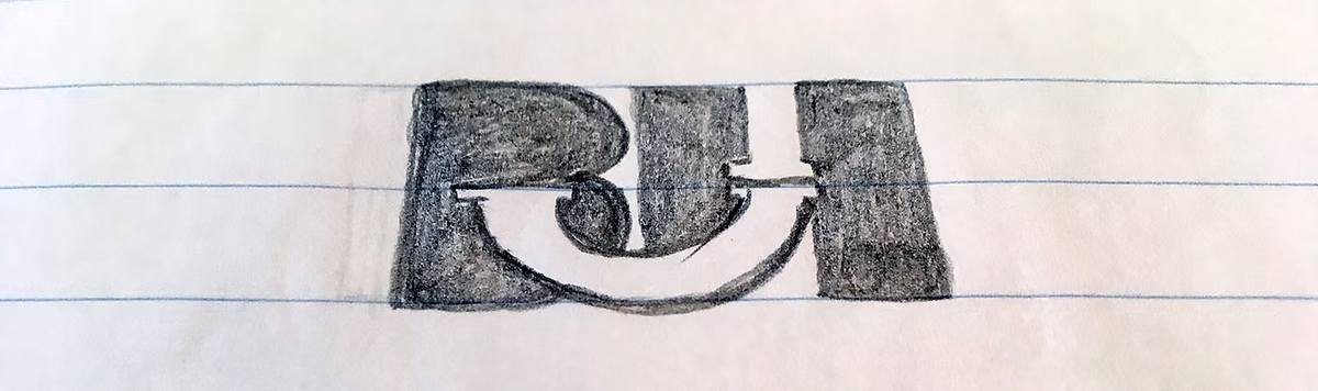
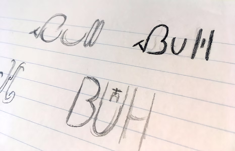
During the briefing, warmth and a love for his job were core values for Managing Director Paul Plattner. This passion for his job was to be communicated both internally, within the team, and externally. When we asked him what his clients often call him as a plumber, he mentioned not only "BUH-Paul" (because of the bathroom and heating system), but also "Readl-Biaga" (Tyrolean for pipe bender).
This gave us the idea to create a bent pipe in the shape of a heart (“passionate pipe bender”):
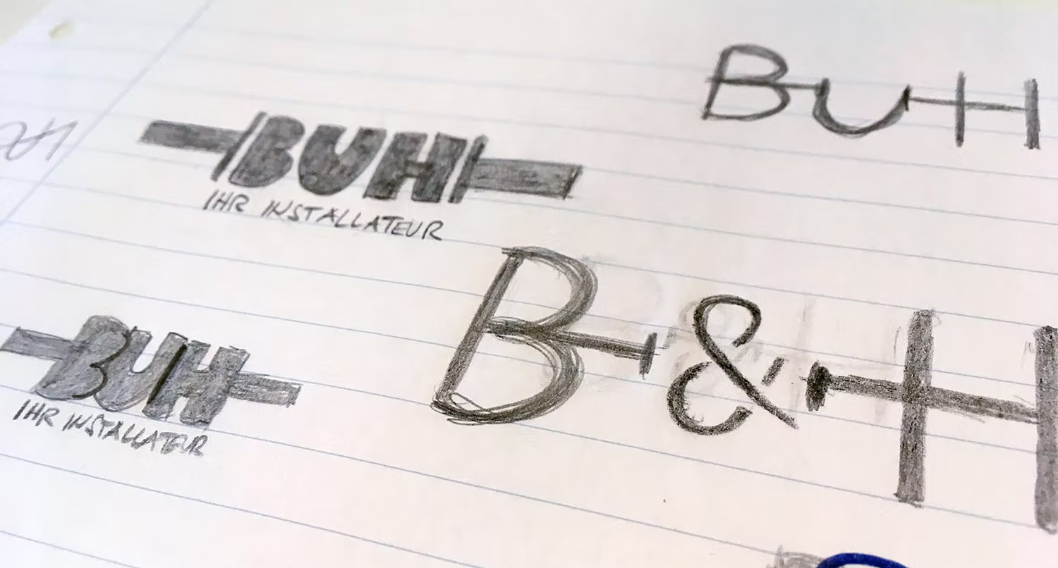
Alternatively, we designed some more classic logo suggestions with nested tubes:
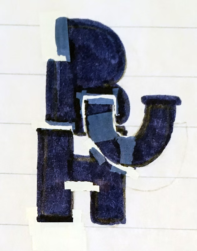
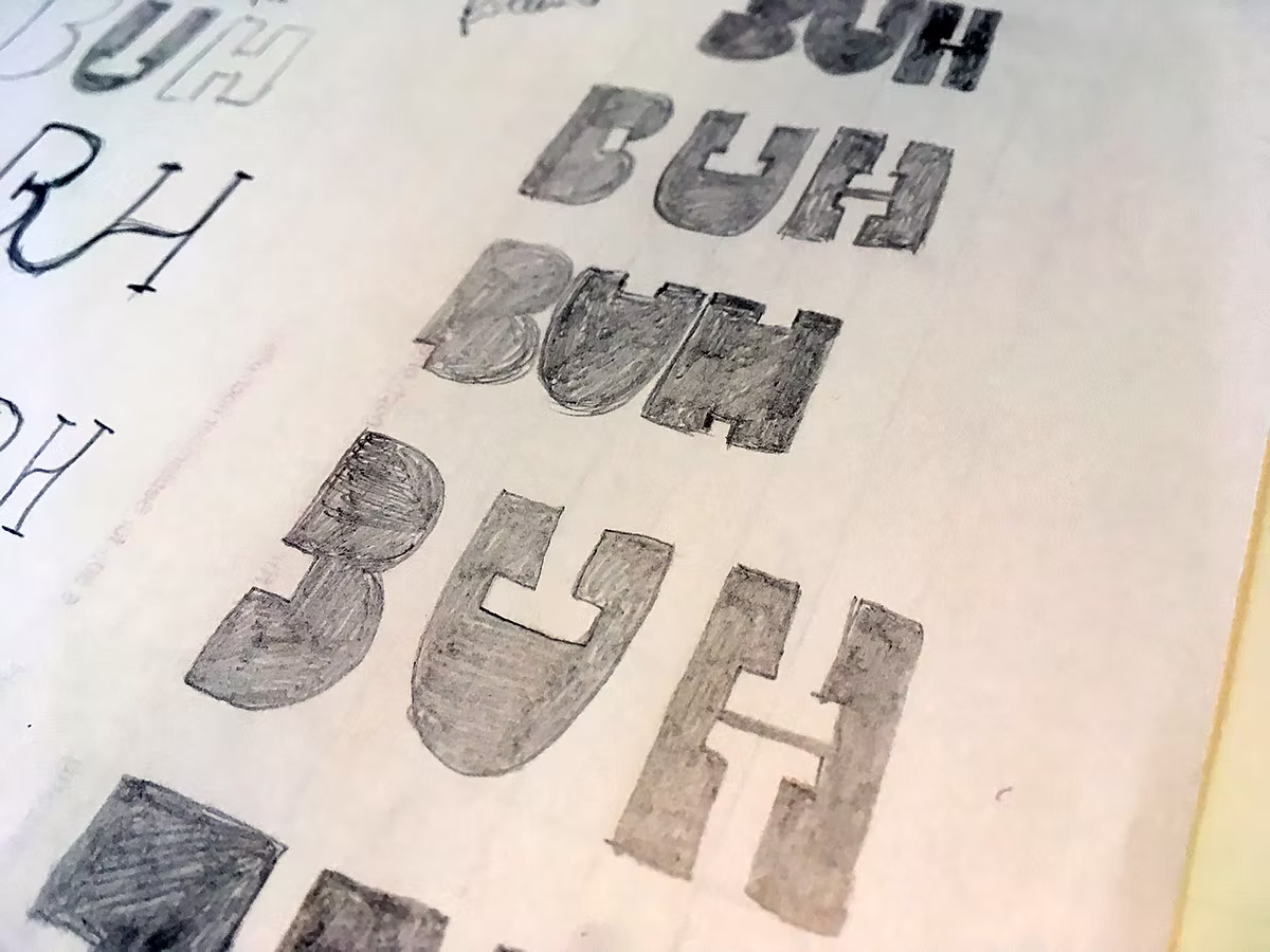
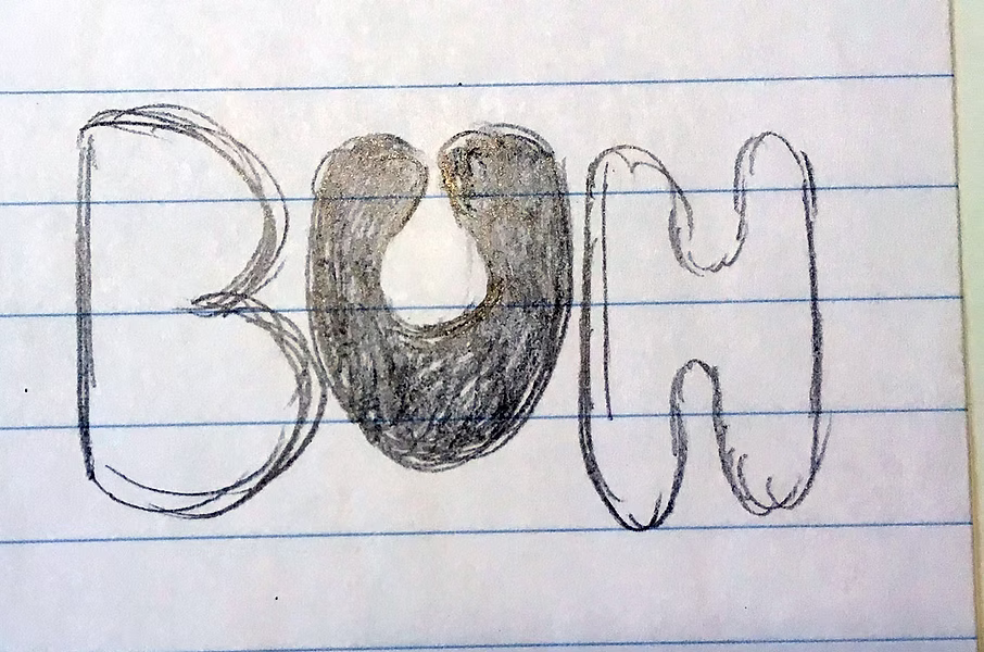
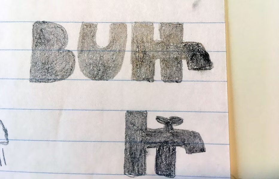
Here you can see logo drafts with faucets, sinks as negative space, drop shapes, heating switches and other plumbing devices:
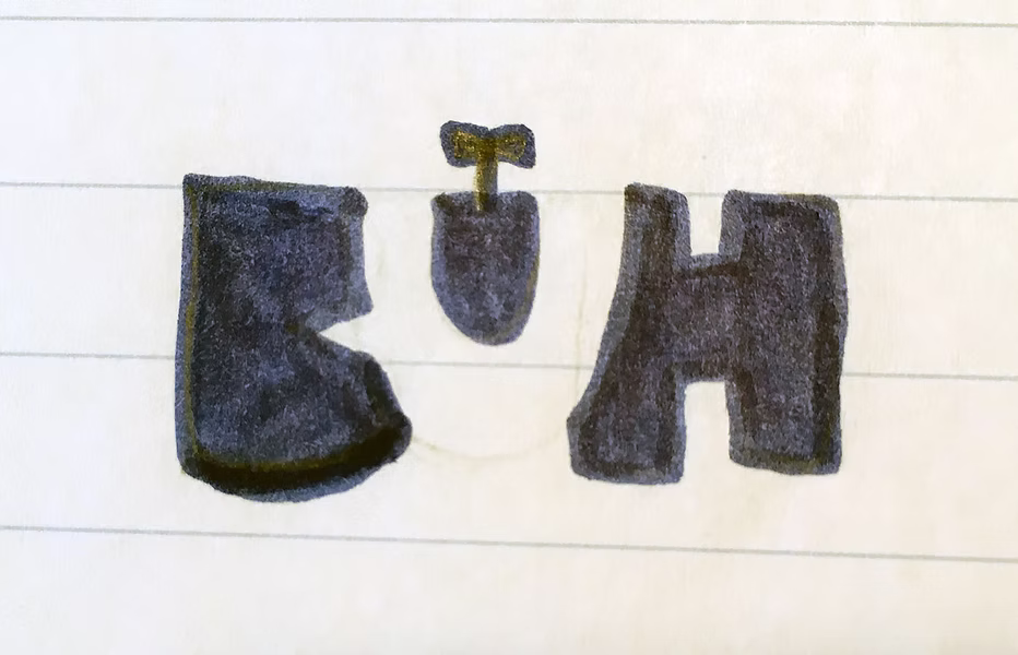
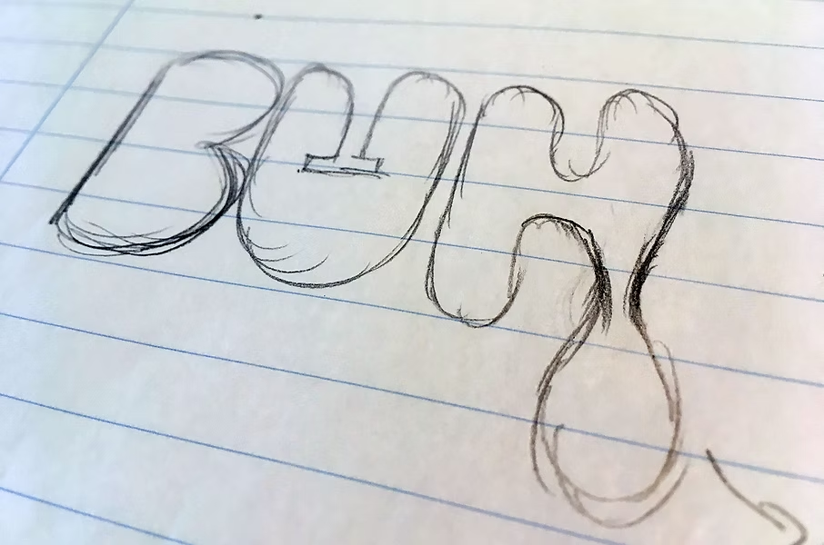
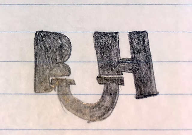
The following logo sketch didn't make it onto our shortlist to present to the client as a rough logo draft. ;-) However, as in any creative process, it's important to "spin and develop every idea, no matter how small."
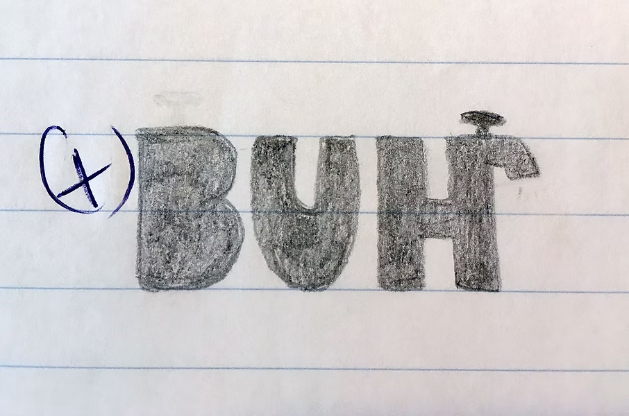
Another classic approach with water and heat waves ultimately won the race. The client ultimately decided against the warm-hearted theme and opted for a more classic version:
Here you can see the final logo:

Logo sketch vs. final artwork
The process from the logo sketch to the final logo is always the same: From all the logo sketches we create, we select the five or so best suited to the brief and the client, we redraw them on the computer, and present them to the client.
During a discussion or after a discussion to discuss the various logo designs, the client decides on a logo variant. The final logo is then created, which is then drawn and colored down to the last detail. During this process, further details of the corporate design are also worked on: secondary stylistic elements, colors, fonts, and more.
More tips:


Working with capital letters

Why you don't need a logo

Why does someone become your customer?
Newsletter
Get inspired by latest client projects, news from the design blog, and gain exclusive access to goodies and promotions reserved exclusively for newsletter recipients. Sent out every two months. Sign up now so you don't miss a thing.