Card Design: Organised Flexibility in a Grid
- May 1, 2016
- 3 min read
Even if you might not be familiar with the term "card design", I’m very sure you know how it looks like. Card design is a kind of module based information transport system that comes mostly in vertical boxes which show pictures and/or text in small pieces that are easy to digest, and often serve as a link to further information.


There are many influences for today’s card design: the flat design trend coming from Microsoft Windows 8, several social media platforms such as Pinterest or Instagram that use an info box system based on a grid; but also the big success of mobile devices with continuously improving UX/UI designs massively contribute to using card designs and make it a huge trend like no other. However, I find it a bit difficult to call this a "trend". Years ago we would have probably spoken of "text boxes" or "memory card design". But as so often in our fast-paced world, this trend has its own, perfect term: "card design".

Example "Hotel Interior" issue 2013/2014 that I designed for the Winkler Medien Verlag: In editorial design, card design has always been a great design element and is still called "box" nowadays, without finding a new word for it.
Card design has many advantages:
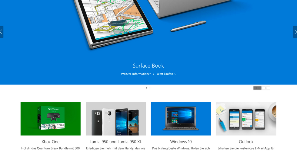
I It allows you to use a structure or a grid and – if executed well – makes website visitors navigate more easily on complex sites.
I Card designs can be perfectly shared as micro content on social media platforms.
I The same piece of information can be presented on different devices without changing the look (a card design looks exactly the same on a desktop, a tablet, a smart phone etc.). This guarantees a perfect, consistent design language across many different channels.
I The website can be designed with a lot of flexibility, as the micro content can be placed in many different areas of the website because the cards mostly have the same width and are based on a pre-defined grid.
No advantages without disadvantages, right? The challenge of using card design is definitely to not make your website look boring or copied from sites like Pinterest for example. As cards are mostly vertical and rectangular, I as a designer have to ask myself: "How do I incorporate a style in the card that does not look copied but perfectly reflects the image of the products of the website owner." This is definitely something that should be taken into account when designing cards. Otherweise your website could look like everybody else’s website.
Let me give you an example - I used card design on my website like this:

The vertical line to the left of the text is a secondary style element in my corporate design and represents the "common thread" in the logo.

When you hover-over with the mouse, the line extends within the card and it gets a certain colour layer (red for corporate design and general topics, yellow for infographics, blue for print editorial design and turquoise for app magazines). This allows me to have a consistent, logical design language that makes my card design stand out from ordinary card designs on other websites and the visual identity of my business is transported perfectly. As you can see, it is crucial to have a consistent design langauge also for card designs, so everything looks professional on the website.
Another thing to consider: The card must not be overloaded with too much content. A picture or gif is enough, a little bit of text and – only if really needed please! – social share buttons. The content in the card must have enough space to breathe, to look nice.
CARD DESIGN: YES OR NO?
Presenting information with a card design makes sense if different information has to be transported at the same time and possibly at the same hierarchy level. Self-contained storys (keyword: story telling, such as a video sales letter) are not suitable for card design as this would only confuse the website user and unnecessarily break up (or even destroy?) the story.
By the way: In my blog post Please no more boring card designs you can find some great inspiration!


Comments