Secondary style element – what is it?
The secondary style element is a component of branding, of corporate design. It is a design element, often derived from the logo design, that runs like a visual constant through all communication media and "holds" a brand together in a homogenous way. It is often the secondary style element that anchors a brand in the memory, sometimes even more than the logo itself.
In this article you will see some examples of secondary style elements from our daily business.
Cubile monitoring health
We created the branding for our client cubile monitoring health in the summer of 2018. Here you can see the logo, which is animated in digital applications:

The yellow horizontal line, which can be shorter or longer depending on its use, serves as a secondary style element for this corporate design. It can be seen in the app icon, on the letterhead, envelopes, business cards, the modular trade show wall, the brochure, and on the website.


Little Luxury
Little Luxury is a fictional food brand in the affordable gourmet segment. We designed the corporate design and packaging in 2012. The logo looks like this:

The icing on the cake of "Little" is a drop, and this drop serves as a secondary style element. The drop can be found, for example, on the olive oil bottleneck ribbon, as a subtle background pattern on the gourmet mustard, and also as a subtle background pattern on the BBQ sauces. This "noble drop" is subtly incorporated throughout the packaging design and is reminiscent of Little Luxury's branding.


Dr. Gasser-Puck
For our client Dr. Gasser-Puck, a highly zoomed portion of the logo symbol serves as a secondary style element. The logo looks like this:

Throughout the corporate design, the curved logo symbol appears repeatedly in a highly zoomed-in view. To add more pizzazz to the branding, we designed the use of the secondary style element to be flexible. The greatly enlarged logo symbol is therefore positioned differently throughout the branding. For example, the stationery comes in three different versions (three different rear pages); the business cards come in two different designs.


Bathroom and heating
In the fall of 2018, we designed a new branding for BAD UND HEIZUNG Installations-GmbH. Here, too, a highly zoomed-in portion of the logo symbol serves as a secondary style element. The logo symbol consists of a water wave and a heat wave.

The secondary style element can be found, for example, on the letterhead, business cards, car stickers and the website.


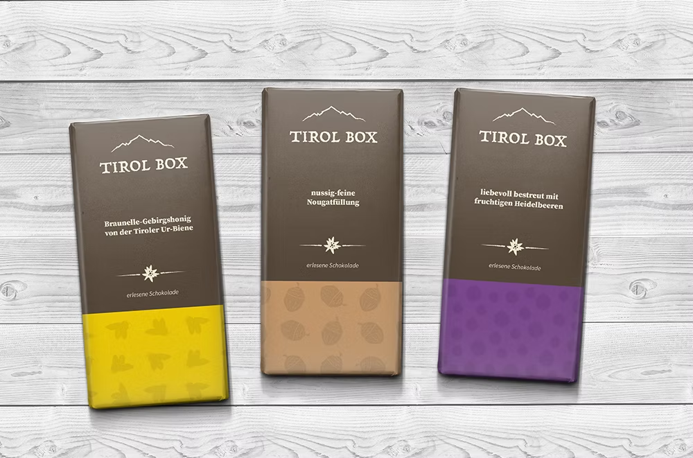
Tirol Box
For the Tirol Box logo, we were inspired by the Serles mountain contour and used a dark brown charcoal outline for the logo symbol to convey a connection to earth and nature.

This corporate design features several secondary style elements, with the charcoal outline recurring throughout all communication touchpoints: various alpine flowers featured on the inside of the packaging. The Tirol Box chocolates feature the charcoal outline in the illustration of the main ingredients. We also used the same charcoal outline on the various image and text buttons, as well as the edelweiss stars in customer reviews on the website, to ensure a consistent look.


More tips:


Working with capital letters

Why you don't need a logo

Why does someone become your customer?
Newsletter
Get inspired by latest client projects, news from the design blog, and gain exclusive access to goodies and promotions reserved exclusively for newsletter recipients. Sent out every two months. Sign up now so you don't miss a thing.