5 Infographic Design Tricks
What is the 100% basis?
There are numbers that add up to 100%. These numbers are best represented as parts of a whole. Then there are numbers that, when added together, don't add up to 100%. Such numbers should, of course, also be represented in relation to each other, but never as parts of a 100% sum.
Combine different numbers in one infographic
Sometimes it makes sense to present several completely different figures in one graphic and combine them thematically and visually. The more different data sets flow into an infographic, the more complex it becomes. You can see an example here:
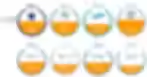
This infographic is part of an entire infographic series we designed for WERTGARANTIE's mobile phone repair marketplace clickrepair. The contours of the circles show how many mobile phone users - depending on the brand - provide their phone with a protective case (for Apple, for example, 86.1%).
The orange areas in the circles show how many cell phone users – again depending on the brand – use a protective film for their phone screen (for Apple, for example, 50.8%). Cases and screen protectors are protective measures for a cell phone, so this topic involves two different metrics, which are best represented in one and the same graphic.
It's important to have a clear visual separation between the different key figures so that the numbers within a data set can be immediately compared. At the same time, the relationship between the numbers from different data sets must also be recognizable. You can see another example in this infographic:

We designed this infographic for the Minor Project Office for Education and Research, funded by the Equal Treatment Office for EU Workers and the German Federal Government Commissioner for Migration, Refugees and Integration. It's about notice periods that employers must adhere to. There are two numbers that are related but not linear: 20 years of employment (bottom right) of an employee is represented by 20 dark green trapezoids. If an employee has worked for a company for 20 years, the employer must give seven months' notice when terminating employment (seven months are represented by seven lighter circles). However, ten years of employment (half) does not mean three and a half months; here it is four months' notice.
The numbers therefore do not correlate linearly. Nevertheless, the different notice periods (symbolized by the light circles) can be quickly compared. At the same time, the increase in years of employment (the dark green trapezoids) can be seen in relation to them.
Design follows function
Every data visualization must serve its intended purpose. If infographics are designed for a social media campaign, they must be as simple and quickly understandable as possible, with minimal text and a sufficiently large font. We always test this on test accounts on Facebook, for example, that are not publicly visible. Testing in a real-life environment is always a good idea.
However, if the infographic is displayed as a large poster at a trade fair, for example, it can of course be more elaborate and complex because trade fair visitors will spend much longer looking at it than scrolling through Facebook.
Color choice: Working with shades
A good data visualization can also be achieved with a few colors. Color differences can be achieved, for example, with different shades.
This is what it looks like in practice: For example, you have a shade of green, then mix in 10, 20, or 30% white, or 10, 20, or 30% black, and you have several shades of green that blend harmoniously together and are wonderfully suitable for data visualization. However, there should be a maximum of five to eight colors. Particularly striking colors are then well suited for certain highlights or heading bars to enable quick navigation within the infographic.
Making invisible differences visible
Sometimes differences in data need to be made visible, even if they aren't particularly large. Here's an example:

This is another infographic from the aforementioned clickrepair study. This time, it's about the likelihood of repurchasing various cell phone models. The differences here range between 90 and 97%. However, with the above representation, the differences would be barely noticeable.

As shown above, we finally handed over this infographic to the client. The focus is clearly on the range between approximately 87 and 97%. However, you can't simply shorten the bars, as this would distort the data visually.
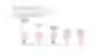
The important symbol circled in red above is the one that indicates a break in the 100% line. This indicates that the upper percentage range is being zoomed in, making the differences much more visible.
More tips:


How I create an infographic – Part 2

How I create an infographic

6 scenarios for working with infographics
Newsletter
Get inspired by latest client projects, news from the design blog, and gain exclusive access to goodies and promotions reserved exclusively for newsletter recipients. Sent out every two months. Sign up now so you don't miss a thing.