How I create an infographic – Part 2
In the first part of "How I Create an Infographic," I covered some of the details you should know when creating an infographic. This page is part 2 and provides further tips.
“Which online tools do you recommend?”
Every now and then, I receive emails from design students asking me which online tools I recommend for creating professional infographics. My honest answer: none. I can't make a recommendation because, as a designer, I don't use online tools and I'm literally creating infographics from scratch in Adobe Illustrator.
I find such online tools somewhat problematic. While they may be quite useful for creating a free or inexpensive infographic in a very short time, most of the time such infographics look the same, or at least very similar.
Furthermore, it tempts people who aren't design-savvy to create infographics themselves, believing that an online tool will compensate for a lack of design expertise. And that's exactly not the case. Since there have been more and more online tools, I see more poorly made infographics than good ones. Without design expertise in terms of colors, shapes, typography, etc., nothing really works. And this is where the infographic project usually fails. So my honest opinion is: stay away from online tools; it's better to avoid creating infographics as a non-designer or hire a professional.
Data, structure, execution
The order of steps in creating an infographic plays a significant role. The readability of an infographic depends crucially on its structure. So, don't just download any ready-made template from the internet and chuck your data into it.
1. Data
First of all, you need the data.
2. Structure
The existing data must be structured logically. This creates a rough initial framework for data visualization.
3. Execution
Only then should you start creating the infographic.
Visual anchor points
Big data visualizations and infographics, especially those with a very comprehensive storytelling theme, require visual anchors. This visually breaks down all the information into small groups and avoids being overwhelmed. One example is colored bars, like the light blue bars in this infographic:


Quantity relation graphics vs. texts
Graphics should generally take up more space than text. After all, it's called an infographic, not an infotext. It's important that the text in infographics isn't rambling PR material, for example, but rather short, concise, and to the point. The text should support the graphics and possibly explain them in more detail, not the other way around.
Symbols from the Internet
When visualizing data, you try to visualize connections and relationships. This means you have to relate data and visualize it with a graphic. Of course, this only works if you design it yourself. You can see a few examples of connections and relationships here:
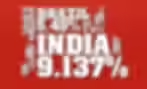
Inflation rates in different countries: Countries with high inflation rates are shown in large letters, countries with low inflation rates are shown in small letters.

Winter Olympics in Innsbruck: You see the ratio between male and female athletes.

Another example is this infographic on water consumption in Germany. It shows that only 8% is used by private households. The black drop on the left shows how small this actually is in relation to total water consumption. And on the right, you can see how this private water consumption breaks down even further.
Such a representation of relationships cannot simply be downloaded from the Internet.
If individual symbols are downloaded from the internet, such as the little man icon for "31% toilet" in the example above, it's recommended to modify the symbols so that they match the look of the rest of the infographic. SVG files are highly recommended here; they can be opened with any version of Adobe Illustrator (cloud or not) and adapted accordingly.
But be careful: Copying ready-made symbols from the internet and mixing them up randomly should definitely be avoided. People will recognize this, and it looks unprofessional and cheap.
Calculations for graphic elements
Of course, graphics must be presented correctly. Inaccurate representations and incorrect diagrams make data visualizations seem unbelievable. Therefore, some prior mathematical knowledge is essential.
Here's an example, which you'll see below. A semicircle corresponds to 100%, the colored parts represent the actual data. As you can see, the yellow "Exceptional" at 3.5% is only a small part of the entire semicircle. The red "Unacceptable" makes up 94%, and almost the entire semicircle is red. All of this makes sense and is consistent. This example was particularly tricky because I had to calculate with round shapes. That means a whole circle has 360°, half a circle has 180°. And if 180° corresponds to 100%, how many degrees does 3.5% correspond to? I had to calculate this myself and then draw it correctly in Illustrator. About three or four steps were necessary to visualize all the data correctly.
I think you can already see the mathematical realms this calculation journey can take you into. Mathematics plays a huge role in infographics, and that shouldn't be underestimated.

Animated web infographics
In addition to static infographics for print or digital, you can also present the whole thing animated on a website. You can see an example here. This animated web infographic was created using HTML5. All individual design elements were previously created in Adobe Illustrator.
Animated gif graphics
If you want to animate an infographic and still use it as an image file, for example, on your website or social media, you can create a so-called gifographic. This is an infographic as a gif image file, in which several automatically playing frames create the animation. Of course, the infographic must first be created in a vector program!
More tips:


How I create an infographic

6 scenarios for working with infographics

5 Infographic Design Tricks
Newsletter
Get inspired by latest client projects, news from the design blog, and gain exclusive access to goodies and promotions reserved exclusively for newsletter recipients. Sent out every two months. Sign up now so you don't miss a thing.