Suchergebnisse
226 Suchergebnisse gefunden
- New function for the app magazine "Blickpunkt LKW+BUS"
The latest issue no. 1-2/2016 of Austria’s largest transport magazine "Blickpunkt LKW+BUS" is now available as print and app magazine for tablets and smart phones (iOS and Android). New is the special swipe effect that allows readers to swipe text boxes out of the display - a reverse pullout tab so to speak. This creates a great visual effect for picture-heavy stories. #editorialdesign #app #interactive
- connecting comPETence ONE:16
I designed the latest issue ONE:16 of the interactive and multimedia app magazine "connecting comPETence" . You can download the app on your iPad or your Android tablet from the Google Play Store . #ipad #app #tablet #andoird #apple
- Design Analysis
My infographic "Heart Attacks on the Rise" that shows facts about heart attacks, their reasons, symptoms and how to prevent them, was thoroughly analyzed by infographicdatabase.com and got an in-depth design review. #infographic
- Adobe Project Faces – Adobe MAX 2015
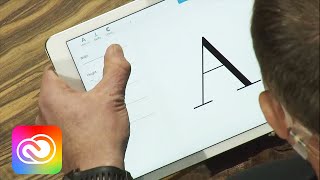
Developing a font is something very complex and requires a lot of expertise, attention to detail and talent. Serifs yes or no, the contrast of a font that has a big impact on the grey tone of a text and many other characteristics give letters a soul and give a text a certain look. This is why there are professional typographers out there, who produce fonts. In autumn 2015, Adobe presented a new project in Adobe MAX: Adobe Project Faces. It looks like a font generation app, but see for yourself (for all non-Americans: Don’t worry, this is not a cult, but a product presentation in American style): I have to admit: Adobe really put a lot of brain and effort into this and obviously worked with absolute typography-pros. Thumbs up! Many aspects of typography have been taken into account here. However, what about: the interplay of letters, the harmony of the copy as a whole and many details like ligatures for example. At the moment, I doubt if Project Face really comes in handy when producing fonts for a big amount of text. It might work for short texts, posters or headers though. If you ever produce a font in Adobe Project Face and want to use it for a big amount of text, please: test, test, test! That simply means: Go into Indesign, put a lot of placeholder text on a few pages and print them out. If Project Faces becomes really popular and takes over in the future, the question comes up, if we will read less books and magazines because of a possibly impaired readability – if Project Face will be used for the main copy by designers who are not very familiar with typography (is Project Face targeted at them? Who knows.) A question, that might be answered not before many years have passed .... #typography #font #fonts #adobe
- "reverse Pull-Out-Tab" in another magazine issue
The latest issue no. 3/2016 of "Blickpunkt LKW+BUS" is available. Besides the editorial design for the print magazine, I was also responsible for the smart phone as well as the tablet app for iOS and Android. In this video, I give you a short insight into this multimedia app. Since beginning of this year, I here and there work with these "reverse pull-out tabs", as I like to call them, for my clients’ interactive rich media magazines. The story titled "Iveco zeigt Flagge" in this video also features this "reverse pull-out tab". #app #tablet #iphone #interactive #magazine
- 6 Motivation Tips for Freelancers
Running your own business is not always easy: You have to overcome many hurdles as a start-up, insecurity as regards finances and business outlook, annoying authority visits, tax prepayments, payments of tax arrears, insurance payments etc. In addition to that, you have to deal with mostly long working hours, short breaks and relaxing times and a lot of mental energy that you have to invest into your business if you want to make it really successful. On the other hand, you probably earn more than you could ever earn as an employee, you are more satisfied and have the freedom of doing what you really like. For some people, self-employment even is the key to finding a "real sense" in their lives. In order to be successful it’s very important to motivate yourself every day. All the energy you invest in your work has to come from somewhere, right? In this blog post, you’ll read about 6 tips that can help you motivate yourself when you run your own business: #1: MOTIVATION FROM YOUR WORK It’s obvious that your work brings you joy. Otherwise, you would not have chosen to do that specific job and have overcome all the hurdles in the starting phase. Often, people consider what they do as "very satisfying" and "meaningful". That already gives you positive energy. It also helps to recall the work day and remember what you have achieved that day. And when you get a positive feedback from a client, that motivates even more. #2: ROLE MODELS Let other entrepreneurs’ success stories inspire you. It’s good to learn from the best, isn’t it? Role models or positive examples motivate and keep you going. Let me give you an example: If you work as a presenter or communication coach, you could study famous speeches of US presidents. Just think of the "yes we can" statements of Barack Obama – what a good example for a successful speech. Look out for role models in your industry and learn from the best. And never forget: Your role models didn’t become successful overnight, but invested a lot of passion, brains and hard work in their success! #3: THE RIGHT ENVIRONMENT Build friendships with other freelancers. If you only have employees around you, you will face a lot of incomprehension. Nobody can understand your problems and you and your business will often be questioned - no matter how successful you are! You could earn more money than all your friends together and be much happier with your life then they are with theirs and you would still encounter comments like "Why do you work so much? You miss your whole life, how stupid" or "you are so successful, I’m sure you could work less". People often don’t understand that success doesn’t fall from heaven, but has to be worked hard for. "Work less" would probably not lead to lasting or growing success. Besides that, some people cannot imagine work to be satisfying and fun. Priorities in life and personal goals of self-employed people often differ massively from the ones employees have. The wrong environment can unfortunately damage a lot of motivation. So: Build friendships with other freelancers! #4: THE IDEAL WORK LIFE BALANCE Try to find your ideal work life balance. I know, it doesn’t sound very revolutionary, but a healthy balance of work and free time is very important to fuel up with energy that you need for your daily job. Plus, don’t forget that you work for yourself and your own goals. And quality definitely trumps quantity! Swimming in a lake at dawn for half an hour can be much more relaxing than sitting in front of the TV for two hours. Everybody is different. Find your very personal ways of relaxing, your very personal "energy stations". And if they are not too time consuming it’s even easier to include them in your everyday life, because regularity is important here! #5: DIET AND SPORTS Everybody knows that a healthy, balanced diet and regular sports have a positive impact on your body and mind. And even though it’s not always easy to implement that in your daily routine, healthy food and some exercise should definitely be part of your life. Replace chocolate and crisps with nuts, fresh fruits or vegetable sticks with a sour cream dip here and there. That provides your brain with healthy energy and you won’t feel tired after eating. That in combination with a little bit of exercise (take the steps instead of the lift, cycle to work instead of taking the car etc.) increases your well-being and you feel much fitter. Your daily contribution for more motivation in your life! #6: REWARDING YOURSELF IS NOT ALLOWED, IT IS A MUST! You work a lot, so you should really reward yourself. When you’re self-employed, you won’t get praised by your boss or your colleagues, because you are your own boss. If you don’t praise yourself, nobody will! So don’t forget to give yourself a pat on the back – especially after closing a new deal or successfully finishing a project. The reward could be going to your favourite restaurant, a weekend trip, a new pair of shoes or whatever. Celebrate the small and big successes in your life! #freelance #entrepreneurship #stress #worklifebalance
- "Schau'ma auf die bauma"
Every three years the bauma takes place in Munich – this year from 11 to 17 April 2016. If you are interested in machines and trucks for construction sites, this fair might be the mecca for you. It features more than 3,400 exhibitors from nearly 60 countries on 575,000 m2 and attracts over half a million visitors from over 200 countries. This makes the bauma the world’s biggest specialized fair. In this blog post you’ll see a few pictures that I took. Copyright: Helene Clara Gamper #bauma #photoshop #photomerge #truck
- Card Design: Organised Flexibility in a Grid
Even if you might not be familiar with the term "card design", I’m very sure you know how it looks like. Card design is a kind of module based information transport system that comes mostly in vertical boxes which show pictures and/or text in small pieces that are easy to digest, and often serve as a link to further information. There are many influences for today’s card design: the flat design trend coming from Microsoft Windows 8, several social media platforms such as Pinterest or Instagram that use an info box system based on a grid; but also the big success of mobile devices with continuously improving UX/UI designs massively contribute to using card designs and make it a huge trend like no other. However, I find it a bit difficult to call this a "trend". Years ago we would have probably spoken of "text boxes" or "memory card design". But as so often in our fast-paced world, this trend has its own, perfect term: "card design". Example "Hotel Interior" issue 2013/2014 that I designed for the Winkler Medien Verlag: In editorial design, card design has always been a great design element and is still called "box" nowadays, without finding a new word for it. Card design has many advantages: I It allows you to use a structure or a grid and – if executed well – makes website visitors navigate more easily on complex sites. I Card designs can be perfectly shared as micro content on social media platforms. I The same piece of information can be presented on different devices without changing the look (a card design looks exactly the same on a desktop, a tablet, a smart phone etc.). This guarantees a perfect, consistent design language across many different channels. I The website can be designed with a lot of flexibility, as the micro content can be placed in many different areas of the website because the cards mostly have the same width and are based on a pre-defined grid. No advantages without disadvantages, right? The challenge of using card design is definitely to not make your website look boring or copied from sites like Pinterest for example. As cards are mostly vertical and rectangular, I as a designer have to ask myself: "How do I incorporate a style in the card that does not look copied but perfectly reflects the image of the products of the website owner." This is definitely something that should be taken into account when designing cards. Otherweise your website could look like everybody else’s website. Let me give you an example - I used card design on my website like this: The vertical line to the left of the text is a secondary style element in my corporate design and represents the "common thread" in the logo. When you hover-over with the mouse, the line extends within the card and it gets a certain colour layer (red for corporate design and general topics, yellow for infographics, blue for print editorial design and turquoise for app magazines). This allows me to have a consistent, logical design language that makes my card design stand out from ordinary card designs on other websites and the visual identity of my business is transported perfectly. As you can see, it is crucial to have a consistent design langauge also for card designs, so everything looks professional on the website. Another thing to consider: The card must not be overloaded with too much content. A picture or gif is enough, a little bit of text and – only if really needed please! – social share buttons. The content in the card must have enough space to breathe, to look nice. CARD DESIGN: YES OR NO? Presenting information with a card design makes sense if different information has to be transported at the same time and possibly at the same hierarchy level. Self-contained storys (keyword: story telling, such as a video sales letter) are not suitable for card design as this would only confuse the website user and unnecessarily break up (or even destroy?) the story. By the way: In my blog post Please no more boring card designs you can find some great inspiration! #carddesign #webdesign #hotel #tmobile #cocacola #rolex #sonoro #microsoft #ibm #linotype
- Desktop + Digital Publishing
Once again, I created a print as well as interactive and multimedia app magazine for iOS and Android tablets and smart phones for Austria's leading transport magazine "Blickpunkt LKW+BUS". Here you can see a few impressions: #desktoppublishing #digitalpublishing #editorialdesign #magazine #app #ios
- Mobile Websites - Boon or Bane?
(This blog article was updated on 2 January 2018.) In spring 2016 I had a meeting with a client to discuss a corporate design for him, including a website design. One thing that came up was a mobile website for smart phones. Many questions came up that needed an answer. And if you look at mobile websites in general, it doesn’t take long to find out that many companies – no matter how renowned they are – have big problems in this field. This dilemma has made me write this blog post. WHAT IS A MOBILE WEBSITE? A mobile website is a website that is specifically made for smart phones, so that the content is user friendly and can be interacted with easily. Let’s take a look at this example: On the left side you see the mobile website of Adidas. In the top left corner you find the mobile menu button which we all have seen before (also called Hamburger menu), there is a search function, it’s easy to navigate, colourful call to action buttons lead the way through the user interface and everything can be read without problems. This is a mobile website. On the right side you see the website of Hilton on my smart phone. The font is way too small, I cannot even read it, you would need mini fingers to tap on the correct selection, there is no typical mobile menu button etc. You just want to go away from this site asap – the most beautiful beach doesn’t make you stay on this website. This is no mobile website. WHAT YOU SHOULD CONSIDER READING HABITS The most common mistake many companies do is to transfer the entire content of the desktop website onto the smart phone. This is foredoomed, especially for large websites. Reason: The reading habits on a smart phone differ a lot from the reading habits on a laptop, tablet or PC. Thinking of the latter, you normally spend more time on a website as you sit on your office chair or your sofa for example. As mobile websites are mostly read "on the go", it means people probably spend less time on them. People want to find the information they need quickly and without hassle, when they visit a mobile website. FROM LANDSCAPE TO PORTRAIT FORMAT The display size and orientation play an important role too. While an ordinary desktop has a landscape format, the smart phone display has a portrait format. This means that the user has to scroll down in order to read the website. Scrolling as such is not a problem as we are used to it when using our smart phones anyway. However: Imagine a website with a lot of copy and how looooooong you would have to scroll down on your phone to read the entire copy, if it’s a 100% replica of the desktop version. Every website owner has to decide for themselves how much scrolling is okay for their target group without annoying them. DIFFERENT DISPLAY SIZES Another hurdle are different mobile phone display sizes. A Samsung phone for example has a totally different height-width-ratio than an iPhone screen. This could mean that a logo or text has enough space on a Samsung phone, but is cut off on an iPhone 4s because the iPhone 4s is slimmer. This is why it could make sense to create a mobile website based on the dimensions of the smallest smart phone display. LOADING TIME The loading time plays an important role. Google punishes websites with a long loading time and ranks them further down in the search result listing; even though Google ranks websites better in case they also offer a mobile website in addition to the desktop version. "LIGHT" WEBSITE You should definitely think about which and how much of your website content you want to display on the mobile version. A smaller version of your desktop website is not only sufficient in most cases, but is often also expected by your customers. Besides loading and scrolling time, consuming content is more challenging on a mobile than it is on a desktop. It’s really important to take this into account! DESIGN TIPS 1. Long scrolling on the smart phone means you can easily lose yourself on the website. A "back to top" button at the bottom of each page or a well-known mobile menu button can help here. The menu button can either be anchored at the top or scroll with the content. In any case the user has to have to ability to quickly and easily navigate through the mobile website. 2. A very important feature is the call button. The easiest thing for a mobile website visitor is to call as they have the phone already in their hands, right?! 3. Take care of the font size. As you can see in the Hilton homepage example, a desktop font size is really not suitable for a mobile website. Good readability has to be guaranteed in order not to annoy the users! TEST, TEST, TEST Please don’t forget to thoroughly test your mobile website on different smart phones. ONGOING MAINTENANCE Don’t forget to think about the ongoing maintenance/administration for your website. If you update your desktop website, you also have to update your mobile website – at the same time please! Nobody wants to read old news. Take this into consideration when choosing which website system to go with. For example, there are systems that use one set of data for the desktop and the mobile website, so you don’t have to administrate two websites. If you update your homepage quite often, this is a crucial point in your every-day business. For my own website, I use WIX which is a WYSIWYG module system based on HTML5. With this system, I can only (!) edit the desktop version of my website, the mobile website uses the desktop data. I cannot add anything extra on my mobile website. What I can do though, is hide elements in the mobile version so that I have a smaller, more compact version of my desktop website for mobile purposes. In addition to that, I can make fonts smaller or bigger just for mobile in order to improve readability on smart phones. I don’t want to promote WIX here, but show what is possible and – in my opinion – works well in every-day business life. WHO NEEDS A MOBILE WEBSITE? Until 2017: This question is not so easy to answer. Let’s take a look at some numbers: More than half of all Google searches worldwide are mobile (source: http://mashable.com/2015/10/12/google-mobile-searches/#EuKeB.UzhaqS ). Okay, strong statement. Before I offered a mobile version of hcg-corporate-designs.com , only 5.31% of my website visitors were mobile (September 2015). In March 2016, after the launch of my mobile website, 15.73% came from a mobile phone. The fact that I offered a mobile website, tripled mobile phone access on my website. However, I work in the B2B segment, and this is where things are a bit different compared to B2C. For the B2C segment or end customer businesses, it definitely makes sense to offer a mobile website in most cases. But in the B2B segment there are business clients that mostly sit in front of their computers and laptops all day anyway and might want to dive deeper into product research. From 2018: Google launched its mobile first policy, as described in Brian Dean's blog (scroll down to chapter 4): Google is crawling websites based on their mobile version - even though you're not on your phone but searching something from your desktop computer! Yes, you read right. Your mobile website will determine your Google ranking in future, not your "normal" homepage. So if you don't have a mobile website yet and if you care about your Google ranking and SEO (and you really should), it's now definitely time to get a mobile website. MY CONCLUSION Offering a mobile website as a "light" version of your desktop website can be a good idea, and if it’s just for SEO reasons. If you are operating in the B2C segment, than you should not just think about a mobile website, but definitely create one. What are your thoughts on this, what are your experiences with your mobile website? I'd love to hear about it, tweet me your opinion. #mobilewebsite #mobile #webdesign #samsung #iphone #adidas #hilton #ux #corporatedesign #wix #html5
- 2 magazines in June
June was busy: I designed two magazine titles for different communication channels. The magazine „connecting comPETence TWO:16“ in English language comes with exciting stories from the international plastics and PET packaging industry. More than 20 articles, also covering a special report about the Namibian beer brewing history, were created with a lot of interactivity and multimedia content for iOS as well as Android tablets. The transport magazine „Blickpunkt LKW+BUS 5/2016“ in German language was designed as a print magazine, a handy smart phone magazine and an interactive and multimedia publication for iOS and Android tablets. Besides special information from the transport industry, you can also find a thrilling story about the Truck Race at the Red Bull Ring in Spielberg/Austria. #ipad #iphone #print #editorialdesign #magazine
- Thailand 2016
Travelling broadens your horizon, inspires and fosters creativity. For me as a designer, travelling is not only a hobby, but an important enrichment at the same time. During my last trip to Thailand in February 2016, I could capture some nice and also funny moments with my camera. But see for yourself … (Copyright: Helene Clara Gamper) #thailand #camera #holiday


Newsletter
Lassen Sie sich inspirieren von aktuellen Kundenprojekten, News aus dem Design-Blog und bekommen Sie exklusiven Zugang zu Goodies und Aktionen, die ausschließlich Newsletter-Empfängern vorbehalten sind. Alle zwei Monate frei Mailbox - jetzt anmelden, damit Sie nichts mehr verpassen.