Search results
205 results found with an empty search
- Photos for the Packaging Design of Tirol Box
I’m often approached with regards to the packaging design of Tirol Box – especially when it comes to the photos on the inner side of the lid. Who would have thought that a snapshot would be received so well? Packaging design for Tirol Box and Tirol Box basic (Copyright photo: Dinkhauser Kartonagen) But let me start from the beginning: My partner Ashley Wiggins and I spent half a day in Stubaital to take a great photo for our Tirol Box packaging, but somehow that didn’t work out as planned. The weather was not in our favour, the scenery as such not good enough for us and we were a bit annoyed by the whole situation in general – where should we get a fantastic photo for our Tirol Box? We then asked a photographer whose work we absolutely love, to help us out. But deep down, we always thought that it should better be us taking the photo for our box – especially as the other photos on the Tirol Box social media channels are our own too. The Tirol Box concept is very much based on our personal impressions – because it is us who decide which products and suppliers may have their space in the box or not, nobody else. Other subscription boxes don’t necessarily do that which is why they often get very bad reviews from their customers. For us, customer experience is extremely important, which is why we personally look at the quality and at the products that make it in our boxes. This is the reason why the picture for the packaging should be taken by us. No sooner said than done – another photographer was no option, we had to manage this ourselves. Tirol Box Hiking from the parking place up to the Obernberger See (Wipptal). It was a nice little afternoon trip to Obernberger See in the very back of the Wipptal, close to the border to Italy. Basically, what we wanted to do is just take a few snapshots for our social media channels, but I instinctively thought „no, this could actually turn out to be a lovely picture for the packaging, let’s see“. At that time, the packaging design was still unfinished and I knew that I desperately wanted to have the most amazing photo for our packaging. I wanted people to open the box and be completely taken away and have the feeling that they are on holiday in Tirol themselves, for a moment. I always aim at transporting emotions with my designs. The water of the Obernberger See is crystal clear – and ice-cold. „Why driving far away to the sea, when the beautiful things are so close?“ We thought until we found out how cold that lake actually was. The distinctive rocks make a great scenery, simply stunning. More rocks ... When my mother’s Jack Russer terrier Mogli walked into the picture. Many clouds in the sky ... They made my photo session a bit tough at times. When the cows came down to drink water out of the lake, people were a bit scared – funny to watch. Photomerge with 20 un-edited raw photos. In order to get everything into the picture nicely, I took 20 photos and used the automatic Photomerge function in Photoshop for merging all pictures seamlessly together. As it was a bit cloudy and windy that day, a cloud flew into my picture here and there, also the weather changed quite rapidly. It was not easy to get everyting in full focus in the short time the weather gave me. So I took it a bit more slowly, made sure everything is in focus and also the beautiful rocks close to the lake I had to get into the picture (these rocks are very typical for that lake). At the end, I had to remove some clouds in Photoshop, spruce up some colours just how they looked like when no clouds were in the sky. And then I had this incredibly beautiful photo that always puts people off their feet every time they see it – even though it was „only“ a snapshot. Tadaaahhh! Final photo for the inner packaging of Tirol Box. After an ice-cold and thus very short swim session, we packed our bags and went downhill back into the valley again. The old restaurant at the Obernberger See. On the way back down to the valley. Going downhill was good for our legs – and provided us with a splendid view. Tirol Box basic For Tirol Box basic, we also went for a very beautiful scenery: the Schlick 2000 in Stubaital. Another snapshot, that was originally planned for our social media channels only, and not for our packaging. Final photo for the inner packaging of Tirol Box basic. Also for Tirol Box basic, I used Photomerge in order to get the photo into our packaging big enough. In addition to that, I faced the challenge of cows walking around and tried to not have them in my picture for the packaging. The cows close to Schlickeralm in Stubaital. After taking the photo, we treated ourselves to regional specialities at Schlickeralm . By the way: the home-made cakes at the Schlickeralm I really highly recommend. Design at the bottom and the inner sides of the packaging. The inside packaging at the bottom and the sides of both boxes comes with light brown Tirolean plants with a coal outline on dark brown background. This adds a little bit of extra luxury to the box design. The packaging manufacturer Dinkhauser (also from Tirol) was so fascinated by the boxes, that they presented them at the Fachpack fair in Nuremberg in September 2016. The audience loved the boxes – and I am very happy that Tirol Box is received so well. (Copyright photos: Helene Clara Gamper, unless stated otherwise. Any printing or copying is forbidden.) #tirolbox #tirol #tirolbox #packaging #packagingdesign
- IAA Nutzfahrzeuge 2016
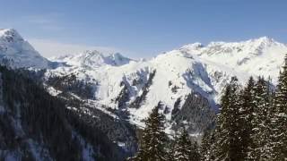
This year’s IAA Commercial Vehicles in Hanover/Germany focused very much on digital connectivity, intelligent vehicles for urban traffic, alternative gears with electricity and gas and autonomous driving. Here you see a few snapshots (copyright: Helene Clara Gamper) #iaa #truck #bus #commercialvehicle
- Tirol Box
Tirol Box is a completely new and innovative monthly subscription box bringing high-quality and handmade products from the Tirolean mountains and valleys to Tirol lovers in many European countries. I came up with the idea for the Tirol Box at the start of 2016. Together with my partner Ashley Wiggins, we developed the brand as it can be seen now in live mode. All details about the branding you can see in my portfolio. #tirolbox #tirolbox #tirol #subscriptionbox #gift
- Magazines, magazines, magazines ...
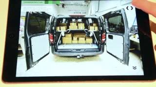
After a summer that was very busy due to the launch of Tirol Box , I got right into my usual design business again: In the last approx. three weeks, I visited the world’s biggest fair for commercial vehicles, the IAA in Hanover, and took many great pictures of outstanding trucks - expect to see some amazing photos in a separate blog post. Autonomously driving, fully connected and digitalised e-vehicles … fascinating! Then I designed issue no. 8/2016 of „Blickpunkt LKW & BUS“ for print, tablet- and smartphone app (iOS and Android). At the same time, I also created issue THREE:16 of the special interest magazine „connecting comPETence“ for Android and iOS tablets. There is also a little video snippet showing you some nice elements of my app magazine work from this month. Enjoy! #magazine #app #tablet #android #ipad #digitalpublishing #editorialdesign
- The cat is out of the bag: Tirol Box is live!
Tirol Box is an idea that I had in the beginning of 2016. Together with Ashley Wiggins, it was developed further and the Gamper & Wiggins OG was founded. After nine months of hard work and "blood, sweat and tears", we leave the cat out of the bag: Tirol Box is live! Tirol Box is a monthly subscription box that delivers high-quality and mostly handmade products directly from Tirol to your doorstep - we deliver in many European countries by the way! Many of the products in our boxes are hard to find, especially when you don’t live in Austria. Most products are especially produced for the boxes, this makes the number of Tirol Boxes limited. The logo design was inspired by the Serles mountain in the Stubai Valley. Its mighty greatness is very visible from Innsbruck and surrounding areas. This mountain was not only chosen for its location and visual greatness, but also the origin of its name. The myth goes that a brutally angry knight called Serles and his two sons were turned to stone after a farmer cursed them for their evil and barbaric tendencies. Where the knight’s castle once stood, now stands the Serles mountain with one large peak and two small peaks either side. All the details about the branding and corporate design of Tirol Box will be revealed in a separate portfolio page on HCG corporate designs, as always - in a few weeks you’ll find out more. In the meantime, I invite you to have a look at the website www.tirol-box.com and enjoy it as much as we do. #tirolbox #tirol #packagingdesign #box #tourism #tirolbox
- Always stay in the grid!
It is one of the very basics in desktop publishing: the grid. Such a grid provides some sort of frame or scaffolding which the entire layout of a publication, including copy and pictures, is based on. Grids can be set up differently, but it should always have a good balance of "rigid structure" and "flexible design". To give you an example: For my architecture magazine I chose a 12 column grid, so I can easily place the copy in 2 or 3 columns, but also have enough white space around nicely designed quotes and pictures. Everything has enough space to "breathe". No matter how a grid is set up: It is very important for the editorial designer to stick to it. But why? Why is a grid of such importance? The grid contributes to a harmonious, visual unity of all stories/chapters. A systematic arrangement of copy and pictures based on a grid, allows the reader to easily navigate through the publication without any hassle. This also accounts for the chapter and page number. Imagine, chapter and page number would be somewhere else on every page, or they are displaced by just a few millimeters on every page. The reader would have massive difficulties to orientate himself, the magazine/book would all of a sudden be "difficult to read". It is important that flicking through is conceived logical and without hurdles. A further aspect is the copy/pictures to possibly shine through, what also has to do with the opacity of the paper used. Papers with bad opacity let the letters on the back of the page shine through what makes the publication look cheap and is often conceived as "low quality". Papers with good opacity are more dense and hardly let the copy/photos shine through the paper. Also here, the grid comes into play: Letters from the back of the page would shine through beyond the text margin on the front of the page, unless the editorial designer sticks to the grid – depending on the opacity quality of the paper of course. Conclusion: A good grid and sticking to it definitely contribute to the success of a publication, making it "easy" and "pleasant" to read. Do you have questions? Drop me a message. #magazine #paper #editorialdesign
- The Truck Race at the Nürburgring in an app
While creating the print magazine as well as the multimedia app for Austria’s largest transport magazine, I also designed a great interactive slide show with amazing photos of this year’s Truck Race at the Nürburgring. You can download the free app of "Blickpunkt LKW+BUS" in the Apple App Store and the Google Play Store . #app #magazine #truckrace #nürburgring
- Something bis is coming up ...
Since beginning of the year Ashley Wiggins (Randall Films) and me are working on something big. Something big under the sign of our love for Tirol. Details are not being disclosed yet. But: You will be amazed. Here you can take a little sneak peek. #tirol #tirolbox
- Quality seal for HCG corporate designs
For me as a graphic designer, it is important to understand the character and the philosophy behind a company or a product. I include this character in a holistic design approach, that follows me through the entire creative process. This is how I can create a unique visual concept and make sure the character of the company or product is represented by its look. A consistent corporate design system is always the goal of my branding process. A good corporate design is based on a good system. This is why I am happy and proud to announce that "initiative corporate design" (short init_cd ) has awarded me with their official quality seal. This obliges me to continue designing in compliance with highest quality standards in corporate design. The "initiative corporate design" is an ExpertsCluster of designaustria and works with high and uniform quality standards in the field of corporate designs. #corporatedesign #logo #branding
- Corporate Design for Martin Holztrattner
"Martin Holztrattner - Austria‘s True Online Marketing Coach" is a young, successful internet entrepreneur from Stans/Austria. Years of experience and valuable expertise on how to financially succeed with an online business are transported on his website, in video trainings and seminars. I developed a holistic corporate design concept, some online banners, buttons and design templates for the website and social media channels, designed flyers, business cards and handout templates. These designs transport a feeling of high quality, professionality, credibility/authenticity, dynamics and the image of a young, hip internet entrepreneur. You can see all the details about this great design job in my portfolio. #corporatedesign #branding #onlinemarketing
- 2 magazines in June
June was busy: I designed two magazine titles for different communication channels. The magazine „connecting comPETence TWO:16“ in English language comes with exciting stories from the international plastics and PET packaging industry. More than 20 articles, also covering a special report about the Namibian beer brewing history, were created with a lot of interactivity and multimedia content for iOS as well as Android tablets. The transport magazine „Blickpunkt LKW+BUS 5/2016“ in German language was designed as a print magazine, a handy smart phone magazine and an interactive and multimedia publication for iOS and Android tablets. Besides special information from the transport industry, you can also find a thrilling story about the Truck Race at the Red Bull Ring in Spielberg/Austria. #ipad #iphone #print #editorialdesign #magazine
- Thailand 2016
Travelling broadens your horizon, inspires and fosters creativity. For me as a designer, travelling is not only a hobby, but an important enrichment at the same time. During my last trip to Thailand in February 2016, I could capture some nice and also funny moments with my camera. But see for yourself … (Copyright: Helene Clara Gamper) #thailand #camera #holiday