


HCI HOPE FOR THE CHILDREN INTERNATIONAL E.V.
LOGO DESIGN, WEBSITE DESIGN CHARITY ORGANISATION

As a non-profit organisation, the goal of HCI Hope for the Children International e.V. is to break the cycle of poverty for children. The focus lies primarily on orphans in Romania. Kindergarten and school projects as well as the Christian spirit are particularly important aspects of the NGO.
We created a new logo design and designed the new, responsive and multilingual website including special donation features.
LOGO DESIGN
It was particularly important for the client to integrate the religious aspect of the NGO into the logo design. Additionally, the new logo design should subtly remind of the old logo design.
old logo design:
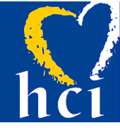
new logo design:
The old logo design was entirely missing the religious aspect of the NGO. Besides that, the colours looked too dark and negative and unfortunately reminded of the colours of the Ukrainian flag - unintentionally. In times of the Russian war in the Ukraine (summer 2022), this was a very unpleasant colouring for a charity organization that has no association with Ukraine.
The new logo design smartly combines a heart shape drawn by a child and an eye-catching yellow cross as a Christian symbol. The sans serif font TT Firs Extrabold conveys the necessary seriousness of the NGO. As an additional decorative font, we chose Fingerpaint, which looks like (well, you can imagine) painted by children's fingers and perfectly matches the heart symbol in the logo design.
The colour of the new logo design was also made happier and more positive. A harmonious combination of light blue, white and sunny yellow conveys optimism, hope and positivity.
WEBDESIGN
The website design picks up the colours of the logo design and creates an interesting structure thanks to subtle picture frame animations. The font TT Firs Extrabold, which was already used in the logo design, makes headlines on the website stand out bold enough to transport the desired emotions.

We often had to work with poor-quality image material. Many of the images were of low resolution and/or the colours did not match properly. We solved this problem by recolouring most of the images to black and white and using them with light blue colour filters or yellow animated picture frames. This is how we made all images perfectly fit together visually and a poor image resolution is hardly relevant any more.

The website was implemented in two languages and also optimised for mobile devices such as tablets and smartphones. (The old website did not meet the necessary responsiveness and usability parameters.)

old website

new website

old website

new website
In addition to implementing a blog on the new website, various payment providers were connected to the backend. This way, the NGO can offer several ways to donate for different purposes. Moreover, people can donate either once with a freely selectable amount or monthly with different amounts - including immediate payment by credit card, debit card and so on.
