


BRAND DESIGN - CUBILE MONITORING HEALTH
CORPORATE IDENTITY DESIGN, CREATIVE LOGO DESIGN, MAGAZINE LAYOUT DESIGN, INFOGRAPHIC DESIGN MEDICINE

CubileHealth is an innovative start-up in the medical industry. The Cubile hardware consists of a foam pad and a small box. The pad is placed underneath a bed’s mattress and measures smallest movements of the patient in a hospital, care home or at home. It collects data about heart and breathing rate, mobility, bed exit and more and sends the data to mobile devices (tablets, smartphones) and computers. The Cubile app detects minimal changes of standard values and then sends a signal to the doctor/nurses in real-time. This allows for more staff efficiency.

Cubile was awarded with the Young Entrepreneur’s Award 2016 of the Austrian Chamber of Commerce and won the Startup Slam 2018 of dHealth. However, the old corporate design, the old logo in particular, was often interpreted wrong and misunderstood by the target group. This is why I was hired in order to create a new brand design including a new creative logo design that triggers the target group successfully and makes them understand the product much better. In addition to that, I designed an infographic, created a magazine layout design (brochure), a website, various icons, a PowerPoint presentation template and a modular exhibition wall.
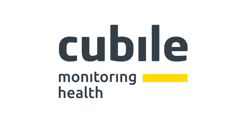
As "signal upon movement" plays a central role for the Cubile sensors, I translated this into the creative logo design and developed an animated company logo design that is used for digital purposes. The "l" minuscule in "cubile" moves, touches the (foam) pad underneath, generates a warning signal and turns into an exclamation mark.
This exclamation mark, combined with the yellow line, stands for the Cubile app (app icon) which sends the warning signal to doctors and nurses in real-time. The app icon increases brand recognition and works perfectly in small and big sizes, printed and digital.


The cubile letters were set in Neo Sans Pro Bold, with +10 % wider letterspacing. The upper ends of the b- and l-minuscules as well as the exclamation mark’s height were manually shifted upwards in order to improve the logo’s readability especially in smaller sizes. Slightly rounded letter ends and a bold style make this font look positive, friendly and still strong and serious.
Neo Sans Std is used for headers in all communication materials. This font is modern and has a subtly futuristic look & feel, without looking dated. Even though, Neo Sans seems quite geometric, the subtly rounded letter ends give it a positive vibe. These rounded letter ends come across very nice especially in a bold style and big size, which is why Neo Sans Std is solely used for headers and corresponding sub-headers.

For all the other text parts I chose Ubuntu, a technically looking, clear font that shows a distinctive character (see t and f). Besides that, Ubuntu is very well suited for being used in small sizes, which makes it perfect for smartphones for example.
Primary colours for the new brand design of Cubile are asphalt grey, alert yellow and pure white. Secondary colours are stone grey and clinic turquoise.


The yellow bar bleeding off the right side, combined with the app icon on the left side, serves as the visual constant that goes through all communication materials. It maximises Cubile’s brand design recognition.


I drew several icons to represent what Cubile measures in an easy and understandable way. The visual constant (the yellow line of the creative logo design and app icon) is used in clinic turquoise for these icons in order to create an optical relation to the company logo design.

The infographic shows a hospital ward equipped with Cubile. This data visualization makes the target group understand Cubile faster.

Cubile needed a flexible and cost-effective way to present themselves at international exhibitions. This is why I designed a modular exhibition wall that can be put together depending on the fair stand’s size.


Just like the magazine layout design / brochure, the website was made in two languages (German and English). It’s fully responsive for desktops, tablets and as a mobile website for smartphones.
All photos for this project were taken by my cooperation partner Paul Santek.
You can find more detailed information in the brand design manual (styleguide).